Handling Multimedia with CSS
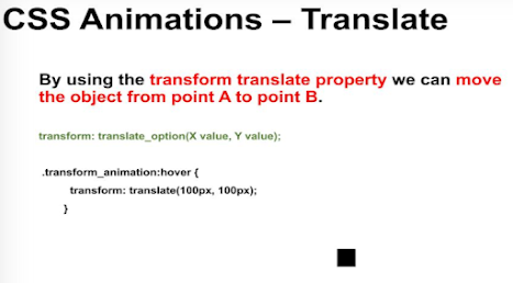
The skew animation attribute
The word “skew” refers to being slanted in English and performs the same job in CSS. The skew function comes in the following variations:
skew(X, Y): To skew the object at an angle X on the X-axis and Y on the Y-axis.
skewX(X): To skew the object at an angle X on the X-axis.
skewY(Y): To skew the object at an angle Y on the Y-axis.
The following code would skew the object at an angle of 30 degrees on the X-axis and an angle of 30 degrees on the Y-axis.
Syntax:-
.transform_animation:hover {
transform: skew(30deg, 30deg);
}
<html> <meta charset="utf-8"><head> <style> .transform_animation { width: 200px; height: 100px; margin-top:20px; background-color: rgb(255, 0, 0); } .transform_animation:hover{ transform:skew(30deg,30deg); } </style></head> <body> <h2>CSS - Multimedia</h2> <centre> <div class = "transform_animation"></div> </centre> </div> </body></html>Output:-

CSS Animations – Keyframes
With this, you would be able to do transformations from point A to point B in a smooth manner. But this is just a single animation we are talking about. We can either choose to expand the width or rotate the object. Doing a single thing will not bring out effective animations that please our eyes. It also challenges the developers!
This is why keyframes were introduced in CSS Animations. It also helps in changing the animations from animation 1 to animation 2 to animation n. On top of it, the developer has the freedom to choose the time (or interval) at which the animation should move from 1 to 2.
There are two ways to achieve the animations using keyframes:
- Using from-to keywords
- Using the percentage assignment
A simple example is as follows:
@keyframes skew_animation {
from {
transform: skew(0deg);
}
to {
transform: skew(30deg);
}
}
This indicates to the CSS Animation that the object needs to be moved from 0 degrees to 30 degrees.
Code:-
<html lang="en" dir="ltr"> <head> <meta charset="utf-8"> <style> .transform_animation { width: 200px; height: 100px; margin-top:10px; background-color: rgb(255, 0, 0); animation-duration: 2s; animation-name: skew_animation; } @keyframes skew_animation { 0% { transform: skew(0deg); } 100% { transform: skew(30deg); } } </style> </head> <body> <h2>CSS - Multimedia</h2> <br> <center> <div class = "transform_animation"> </div> </center> </body> </html>Output:-


Written by: W.A. Eranga Dewmini


No comments:
Post a Comment